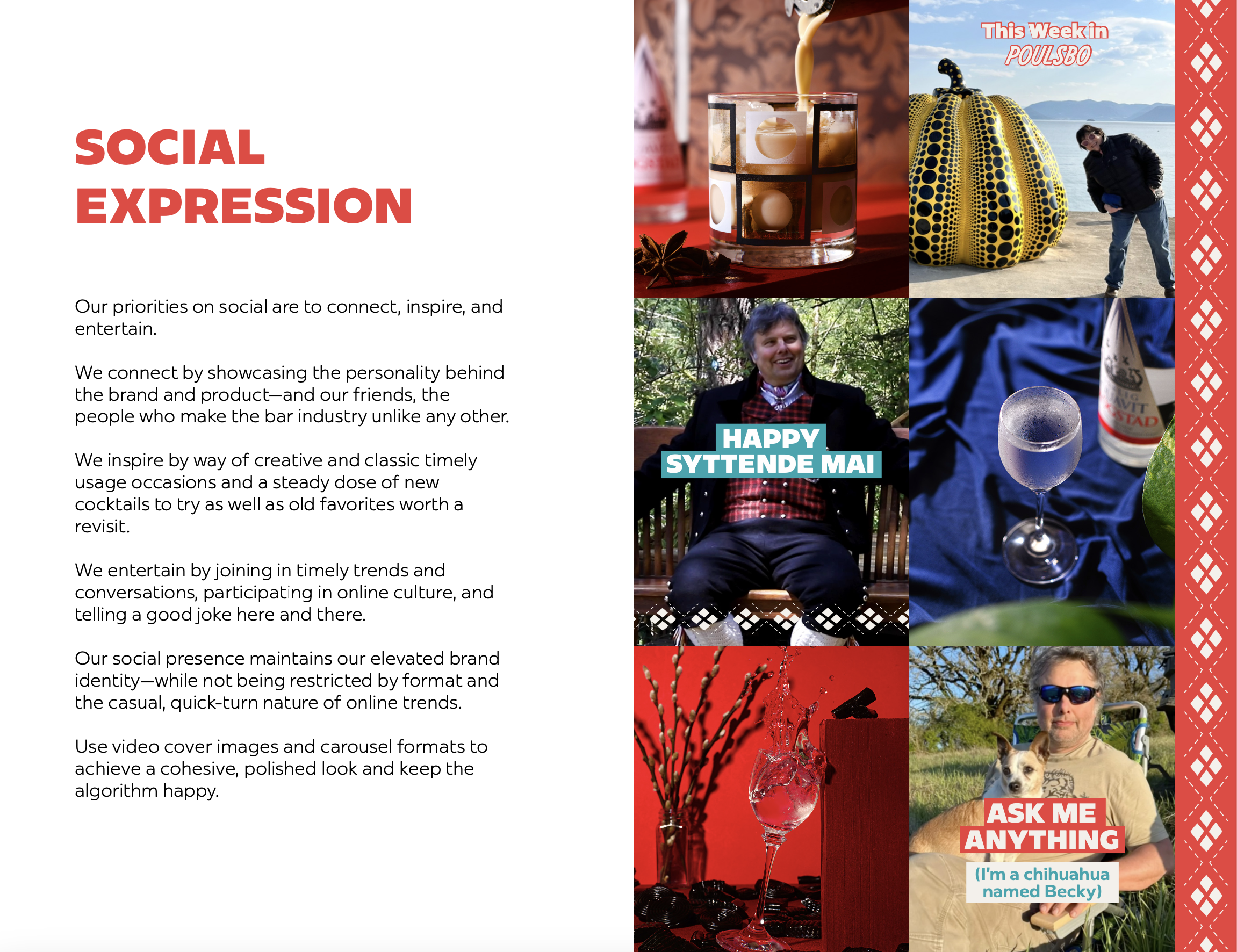
BRAND IDENTITY + LOGO REFRESH
that preserved 20 years of visual equity—and added a dose of vintage Scandinavian charm.
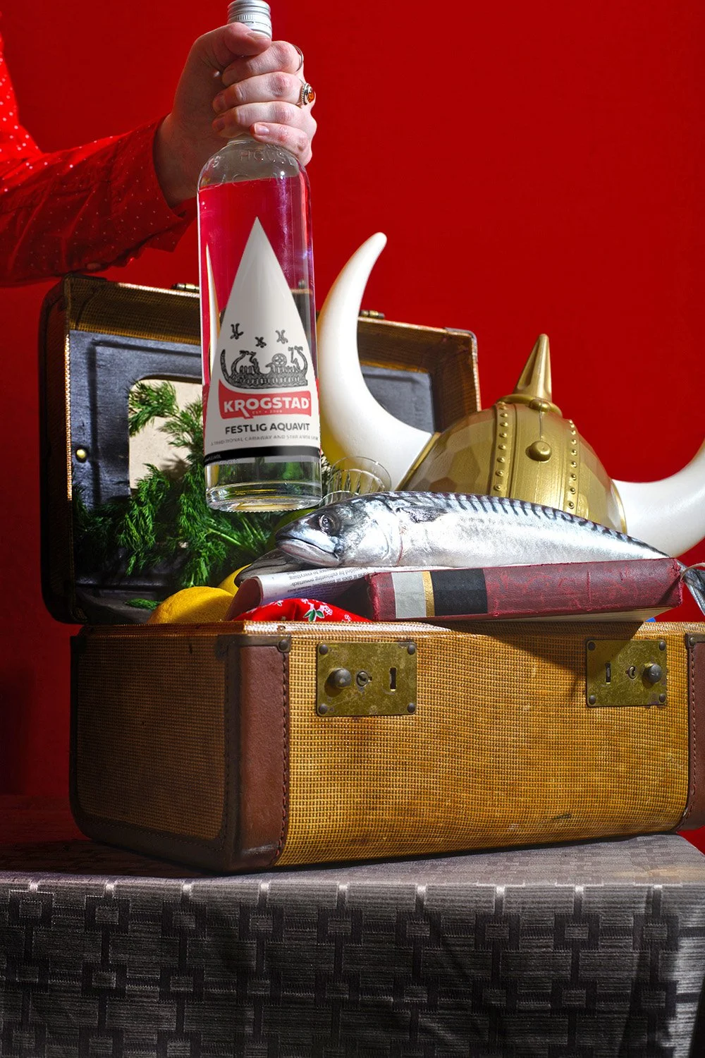
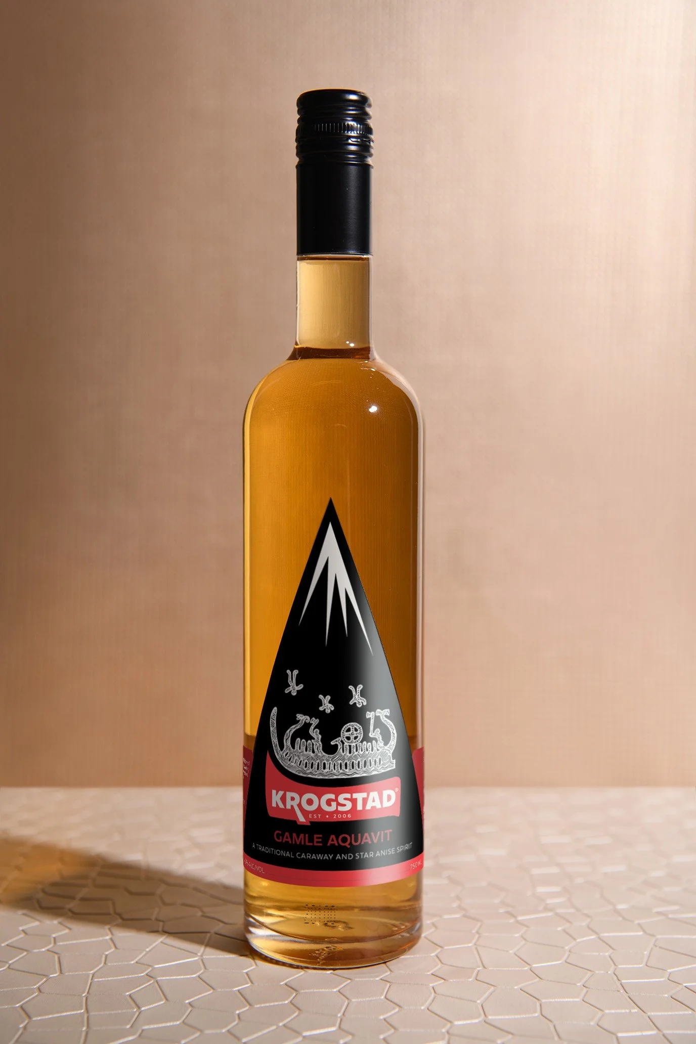
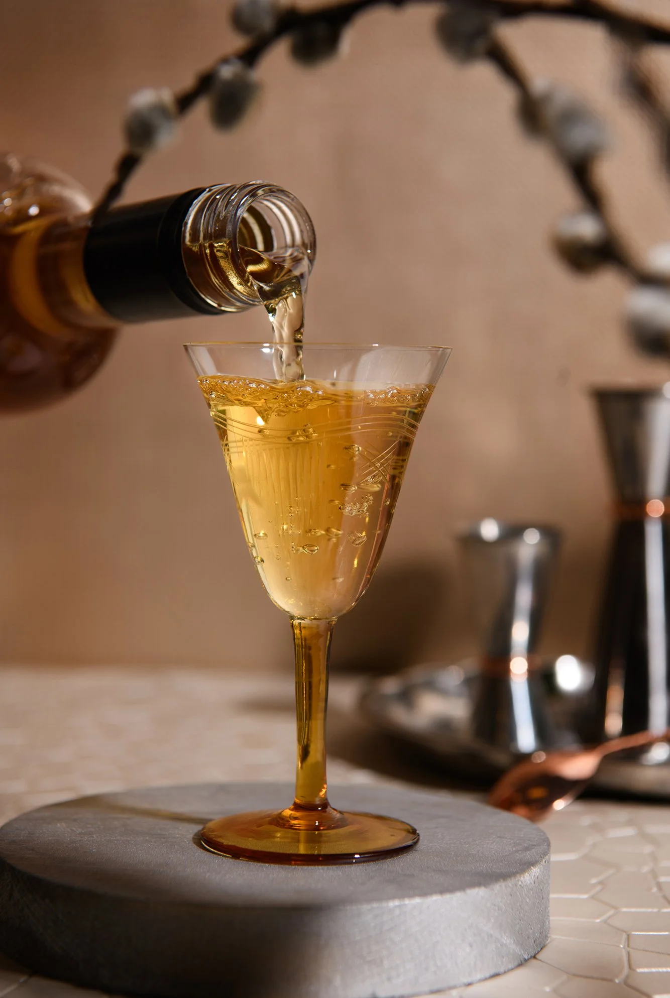
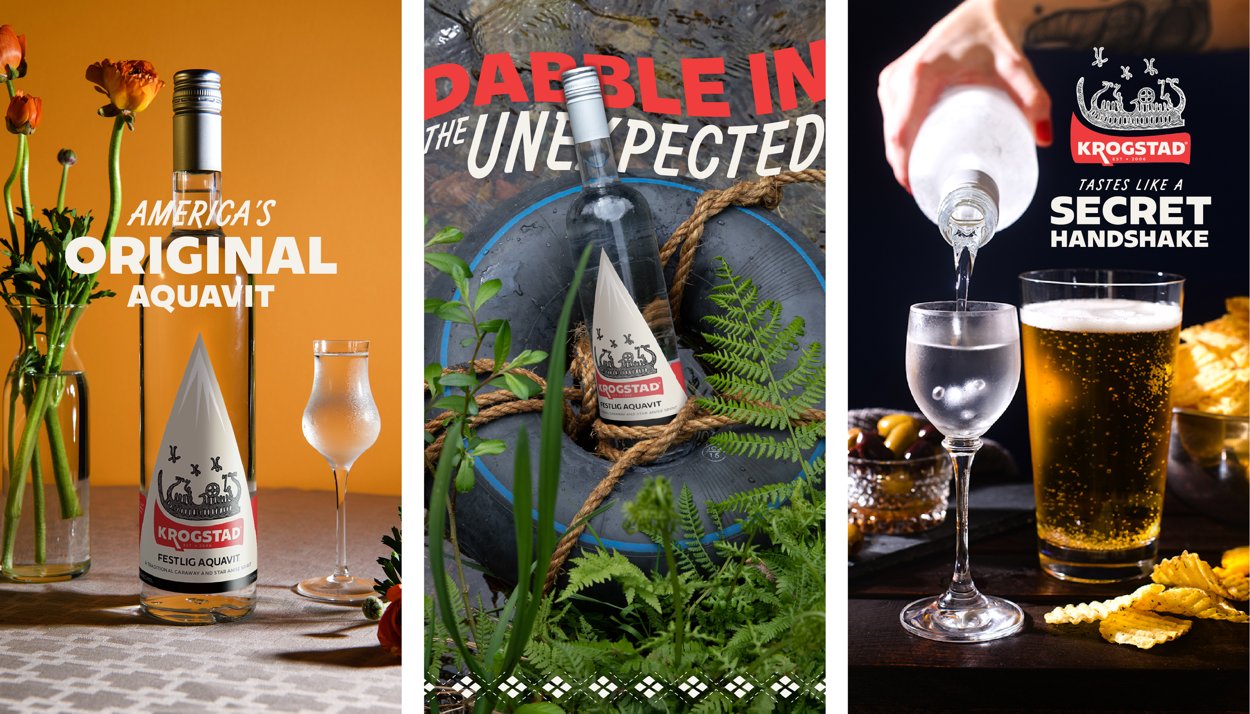
Krogstad Aquavit is the American aquavit—the first to be distilled stateside in 2006, bringing a somewhat obscure spirit to the American bar. In gearing up for their 20th anniversary, I worked closely with owners Christian and Christina to develop a brand identity to take them into the coming decades. We wanted to:
Modernize their existing logo
Develop a true brand system and a versatile library of assets
Pave the way for some seriously exciting line extensions
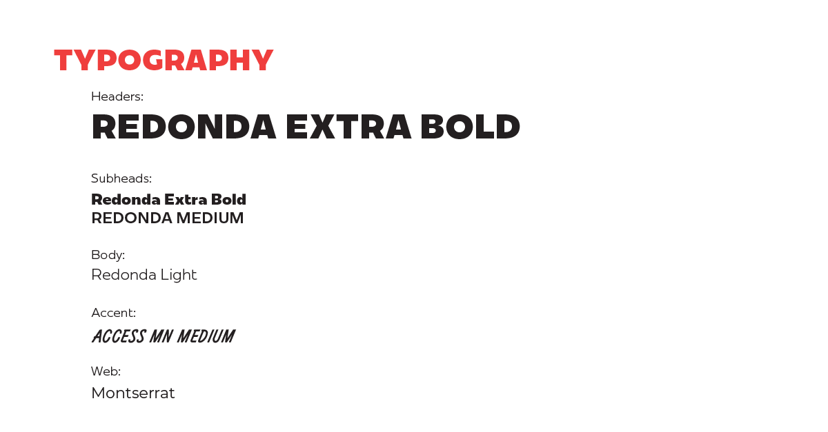
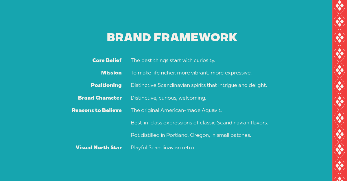
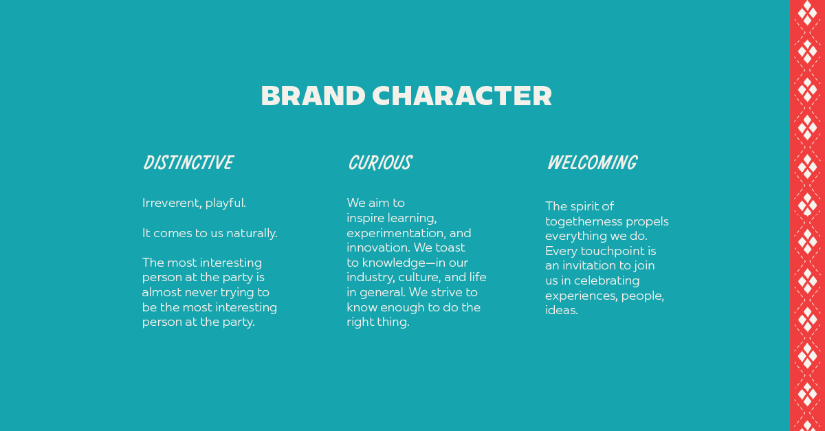
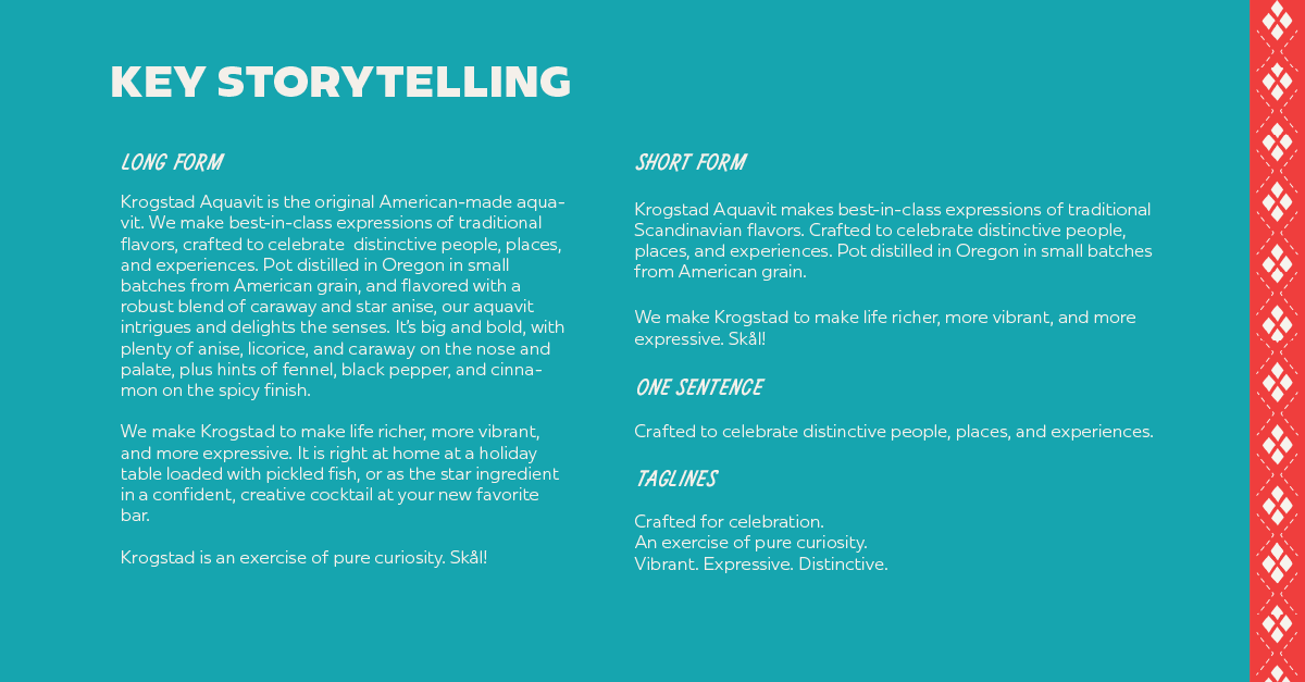
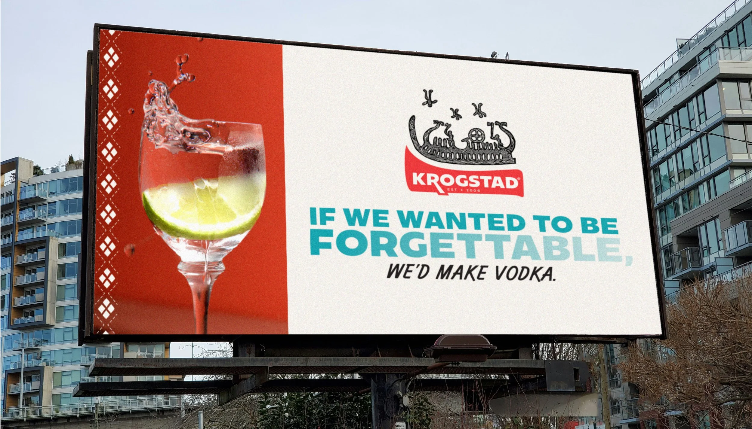
Update their messaging to ring more true to who they are, and
Formalize/refresh our existing creative direction.
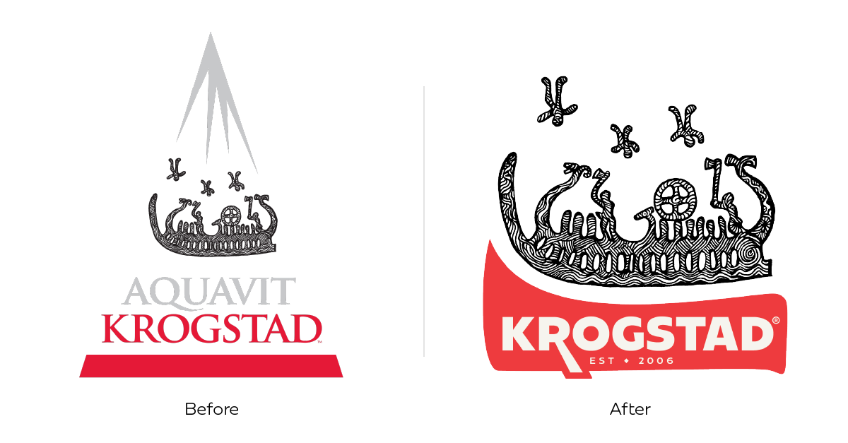
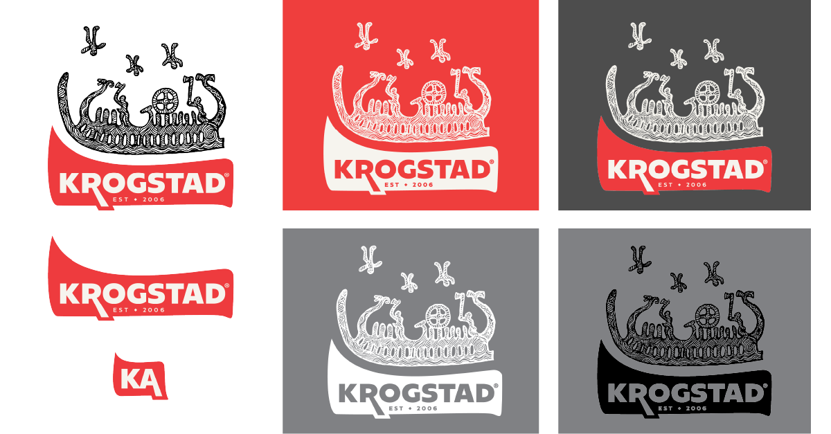
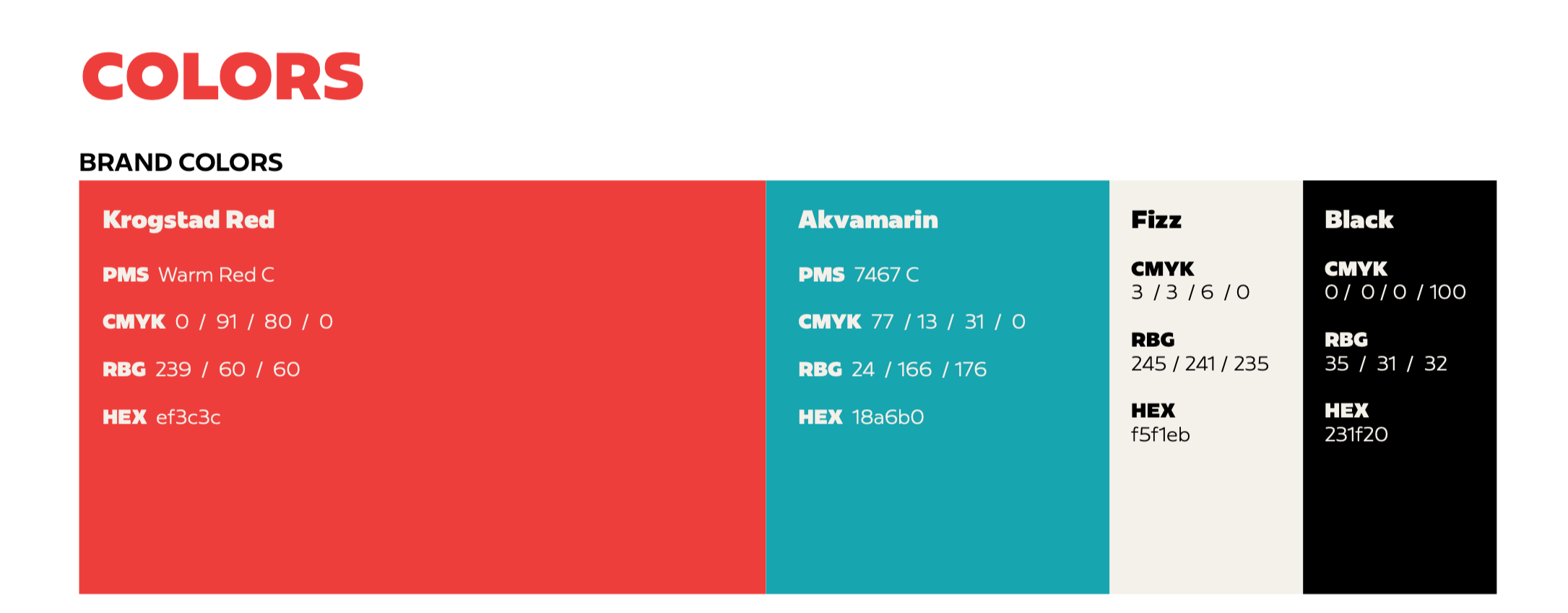
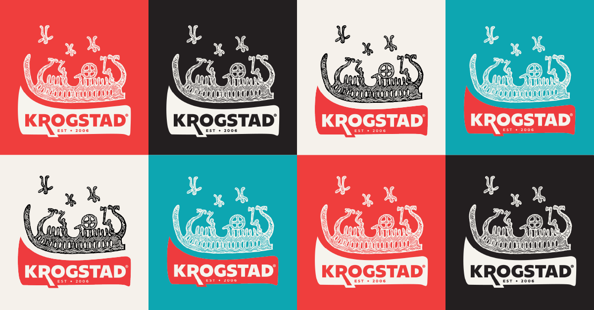
We kept the iconic illustrated Viking ship, and of course, the sailors ascending to Valhalla. We added an abstracted shape—a ship or a wave, depending on context—to ground the visual and serve as a standalone logo when needed. We warmed and softened the red to play better with other colors we brought into the fold: Warmer, richer, versatile hues.